_corporate design
Stadtbäckerei Rahn
Development of a fresh, enjoyable brand image - with a better perception of the brand core values of quality, craftsmanship and the focus: Enjoyment with tradition since 1953.
Logo & Corporate Design
Based on the already existing logo, the colors have been adjusted to underline a more elegant and refined look. The colors create a very good contrast to the competition. The pretzel now serves as a design element. A new claim has been added: Enjoyment with tradition.
Imagery
For the relaunch of the bakery, a new key visual had to be chosen. A striking motif was photographed that combined the color code and the claim enjoyment with tradition. For other sections, new key visuals have been chosen too.

Key Visual: Specialties

Key Visual: Pastries

Key Visual: Breakfast

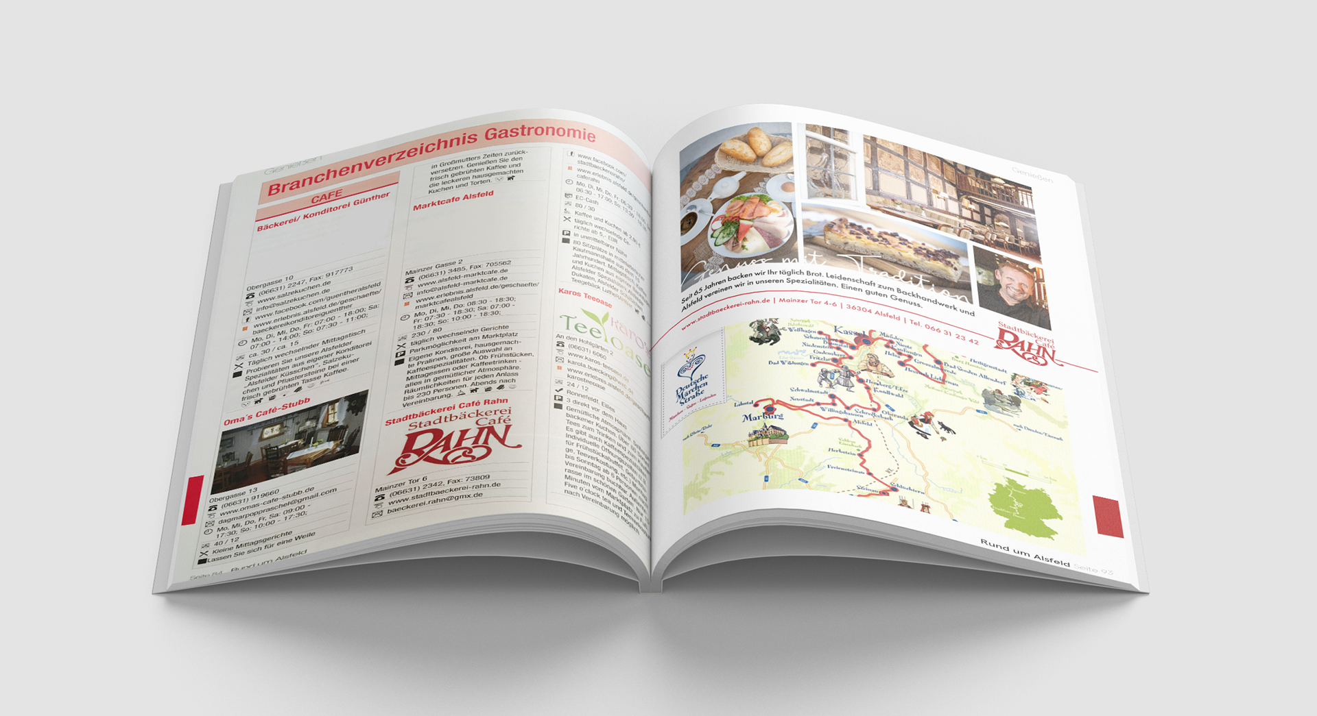
Newspaper Advertisement

Imageflyer

Stationary

Business Cards
Social Media
The print look had to be adapted for social media, like Facebook, Instagram and youtube.


Branding
The new fresh corporate look was adapted to various products, like uniforms, vehicles and give-aways.

Uniform Apron

Table Calender

Vehicle for delivery

Paper Cups
Sale Promotion
Alsfeld is located on the German fairytale street. Therefore a sale promotion was launched with fairytale "Berliner". Each of the seven "Berliner" was created to resemble a German fairytale. The look of the promotion sale resembled a children's story book.
Alsfeld Specialty Promotion
Alsfeld Specialty Edition: This consists of cake toppers, chocolate toppers and liqueur bottles. For the design, packaging was considered for each product, as well as a uniform look to match historical Alsfeld. The edition is expanded by one product every year. In 2020 a glass bottle filled with marzipan dragees has been added to the edition.


65 Anniversary Promotion
For the anniversary of the bakery various give-aways had been branded. A small celebration event with music and delicious specialties was organized.

Balloons

Garland

Key chain

Anniversary Flyer

Shopper


